Websites built with Blocs use the Bootstrap framework, when a site that uses Bootstrap is viewed on a mobile device, the standard navigation links become a toggle menu that is accessed via a button, this is normal behaviour as it improves the mobile user experience.
Changing the Toggle Menu Style
Bootstrap displays a standard dropdown menu when the navigation toggle is clicked, there are times when you may wish to change this to give your site menu greater impact. Blocs comes with a number of alternative menu styles you can use in-place of the default drop down menu. To select one, first select the navigation toggle item by Left Clicking it on the design canvas or if it’s hidden locate it in the layer tree.
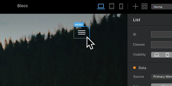
Now navigate to the drop down button labelled Style, by default this option is set to Dropdown Menu.
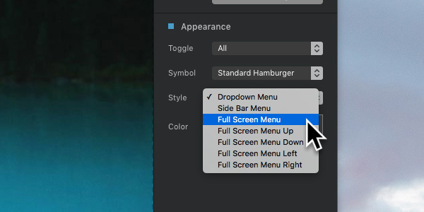
You can easily replace the default drop down menu by Left Clicking one of the available pre-defined menu styles.
Styling Toggle Menus
All of the pre-defined toggle menus that come with Blocs have a basic style that consists of white text with a black background. It’s possible to style these menus in great detail with special sub-classes that can be added via the Class Manager. You can read more about adding sub-classes via the class manager here.
It’s also possible to set the appearance of the toggle menu symbol as well as setting the breakpoint you want it to be visible on.
Link Styling
If you would like to set the visual style of the navigation text links, that can be easily done using the project settings text options.