Columns are one of the key structural elements within the Blocs application, along with rows and Bloc containers they form the foundation on which your site layout is built. Columns have various options that let you customise their size, offset, order and content alignment. All options can be adjusted per breakpoint, which means you can tailor column layouts based on the screen size they are being viewed on, for an optimal mobile user experience.
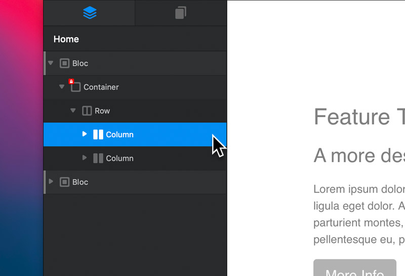
Selecting a column
Because the content that is nested within a column may occupy the entire space of a column, it can be tricky to select them directly via the design canvas. The easiest way to select a column is using the layer tree.
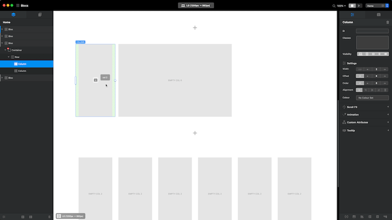
Column width
Columns have various width settings that can be applied using the canvas controls or via the sidebar inspector controls. The easiest way to resize a column is to select it on the design canvas and simply drag the resize handle located on the right side of the column selection marker.
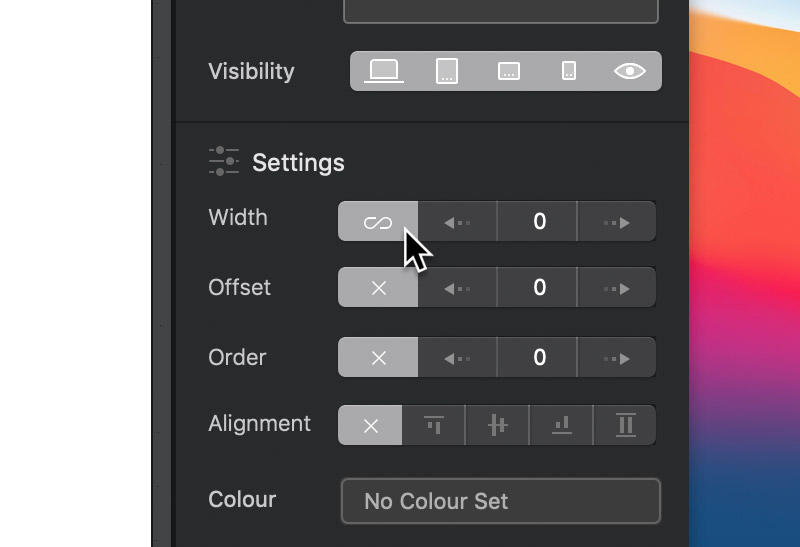
Fixed size
The layout grid within Blocs is broken up into 12 columns that are evenly sized to fill the available main site container space. A column can have a fixed size from 1 to 12, when a column has a fixed size, it will only occupy enough space to fill the correct percentage of space allowed when this space is divided into 12 columns. For example, if a column has a width of 6, it will occupy half of 12, meaning it will take up 50% of the screen space.
Inherited size
If a column has its size set to inherit ∞ on all breakpoints, it will no longer be fixed and will instead automatically set its size based on the number of columns within the parent row, to create an even coverage of the available space. For example, if you have 2 columns set to inherit, each column will take up 50% of the available space.
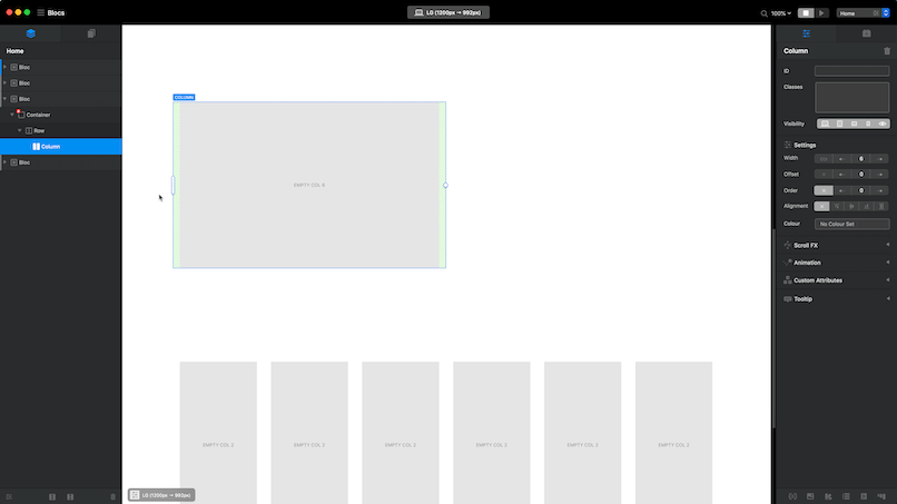
Column offset
The column offset lets you set the offset space found on the left of the column, it can be used to center columns horizontally, or to create space between columns. The easiest way to set the offset of a column is to select it on the design canvas and drag the offset handle located on the left side of the column selection marker.
Column order
The column order controls can be a little confusing when using them for the first time. This is because it may appear that the settings have no effect, if they are not set up correctly. The column order controls let you set the order of a column within the parent row, by default columns are ordered from left to right in the order that they physically exist (within the DOM tree).
Understanding column ordering
When a column has its order value customised, it will always be displayed after all columns that do not have a custom order applied. So if you have 2 columns and set the first column to order 1 it will move behind the second column rather than stay in the same 1st position. This is because although the column is set to be positioned first, the other column(s) within the parent row do not have a custom order setting, so they are displayed before those with custom values. If you then apply a custom order to what was the second column, but is now the first and set its order position to 2, you will see that it now moves to the end of the columns and sits behind the column with the custom order of 1.
You can find out more about column ordering and how it works in Bootstrap 4 here.
Column alignment
The column alignment controls let you quickly and easily align a column to the top, middle or bottom of the parent row. These controls also let you force all elements within a column to stretch to the full height of the parent column, this can be useful when you want card Brics to be evenly sized in height.